If you enrich your documents properly, they become more of a mini-website than a print composition. So it is important to follow web design trends, as they will directly influence your creations. 2019 isn’t over yet, but web designers are already foreshadowing 2020 trends with their choices. Here we break them down for you, one at a time.
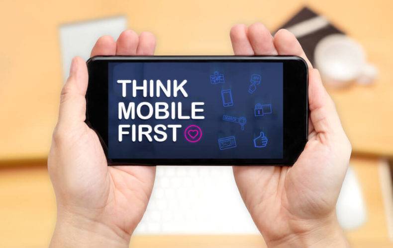
Mobile First
Most people access the internet from mobile devices these days: 46% of people who use the internet do so from a smartphone, 35% use a computer and 7% use a tablet. Google has already integrated this concept into their algorithm and now indexes mobile compatible websites first. So think mobile first when designing interactive documents!
Bold Fonts
Bold fonts will be very popular in 2020. They have the advantage of being visible at first glance. They are usually used for titles, hooks and important information. Subtitles are usually lighter, which provides an efficient way to rank information and guide the reader.

Bright Colours
The influence of colours on readers is clear. Studies have shown that we form an opinion on a product in fewer than 90 seconds and 90% of that decision is based on colour. Each colour has different effects. Red increases the heart rate, for example. It can be associated with love, desire, energy and sometimes violence. Green is associated with nature and produces a relaxing effect. From a practical point of view, bright colours attract the eye, which is a clear priority for any web designer who wants to optimise the reader experience.
Natural Shapes
The playing field for web designers is always changing… but one thing is sure, aesthetics are just as important as content. As bright colours arrive, new shapes are being created. In contrast to geometric shapes such as the square or triangle, rounded shapes are more natural, creating an impression of movement and generating a feeling of comfort.
Animations Abound
Web design agencies know to avoid static images in their creations, instead, using animations that engage the visitor in a more impactful experience. Interaction between the user and your mini website will also help you develop your brand universe and refine the quality of your storytelling. In your interactive document, you could try animating numbers and titles, for example.
Minimalism
Research shows that emptiness is in. Minimalism and empty spaces will always be present online: they can be inserted between text blocks to make space in the layout or used to highlight elements. Keep it simple, keep it minimal! The screen will be much less crowded. Visitors like it when pages are easy to read, so minimalism is a great way to limit your bounce rate.

Asymmetry
Using the grid is one of the first things a web designer learns for making pages with attractive layouts. Now, many designers are trying to leave the grid behind, leaving space for their creativity and bringing more energy to their web pages.

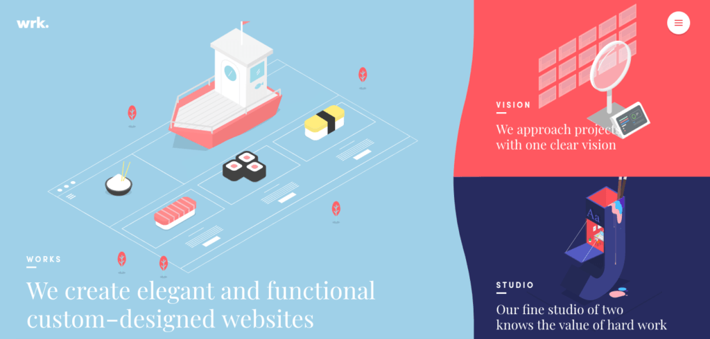
Material Design
Created by Google over ten years ago, Material Design has been gaining in popularity over the past 4 years. Unlike Flat Design, it is based on real objects and adds in geometric shapes and shadows.
Did you like this article? Share it!


No comments.