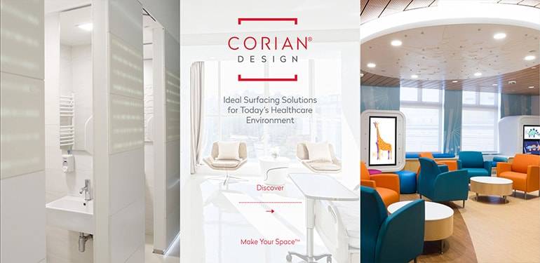
Do you want potential customers to remember you? You need dynamic, engaging interactive brochures!
Read this article to learn how to design one.
How to make your interactive brochures more effective?
You probably already have print versions of your brochures. If you want to reach a wider audience and stay within your budget, a digital version of your content is the perfect solution. But before you get started, we thought it would be a good idea to remind you of 5 essential tips for designing an effective printed brochure. These 5 tips also apply to interactive brochures.
- Think customer-centric: put yourself in your client’s shoes. What are they interested in? The advantages of your products and services, of course. How modern your facilities are, or how happy your team is, are not really important to them.
- Find the right message: decide what message should appear on the cover in advance. A powerful hook is very important. It must make the reader decide to open the document! It takes a reader less than 3 seconds on average to evaluate the cover of your brochure, so a short and punchy hook is essential.
- Organise the information: the most important information should be read first. Use bullet points to improve readability. Remember that your readers are busy, so reading your brochure should not take up too much of their time.
- Choose the right visuals (or find the right graphics): you’ve heard Confucius’ famous quote, “an image is worth a thousand words”. This is particularly true for brochures. Visuals should convey your message above all else, but they should also be surprising and interesting to readers.
- Try to limit yourself to 3 colours and choose the right font: to keep your brochure simple and easy to read, don’t use more than 3 colours. You can, of course, ignore this rule! Your brochure just needs to be visually balanced. Use simple fonts that are easy to read: sans serif fonts are a perfect choice.
Making printed brochures is one thing, making interactive brochures is something entirely different. These 5 tips also apply to interactive brochures, but there are other factors to consider if you want your interactive brochure to be effective. Here are 5 more tips.
- Enrich your content: forget about static content and take advantage of what you can do digitally. A digital brochure is more likely to interest your readers if it is dynamic. The goal, of course, is to give your publication life. So forget static PDFs!
- Improve your reader’s experience: in digital media, the experience is everything. Invent an experience that sets you apart so that your readers remember your content. For example, if you need to make a brochure to promote the British Grand Prix, include a video of a Formula One car that starts automatically when the document is opened. Excitement guaranteed!
- Get your reader involved: they will remember you better if they've actually participated in something. American researchers have found that we remember 10% of what we read and 90% of what we do. Some parts of your brochure should be interactive. Do you sell trendy lamps with a refined design? Let your reader zoom in so they can admire the curves of your product, let them click to learn more about it and allow them to share your publication. You can also add a quiz to see which lamp your readers like best.
- User-friendly navigation: starting with the home page, you need to optimise navigation for your readers, even if your document is only 4 pages long. Users will quickly abandon a publication on the first page if navigation is confusing. Add a menu, shortcuts and go to page buttons so that your reader can easily find their way around your brochure. Also, avoid adding too much text. Smartphone screens are often small and having to zoom to read each sentence is tedious.
- Make sure your documents can be read on all devices: phone, tablet or desktop. A multi-device brochure is more accessible and will reach a wider audience.
Here you can see an example of an interactive brochure created by Webpublication. If you want to create interactive brochures that pop without writing a single line of code, Webpublication is for you!
Did you like this article? Share it!


No comments.