Platform
The Administration area of the Webpublication Platform has been fully redesigned to allow for higher efficiency and ease of use.
Different view modes Grid and Row
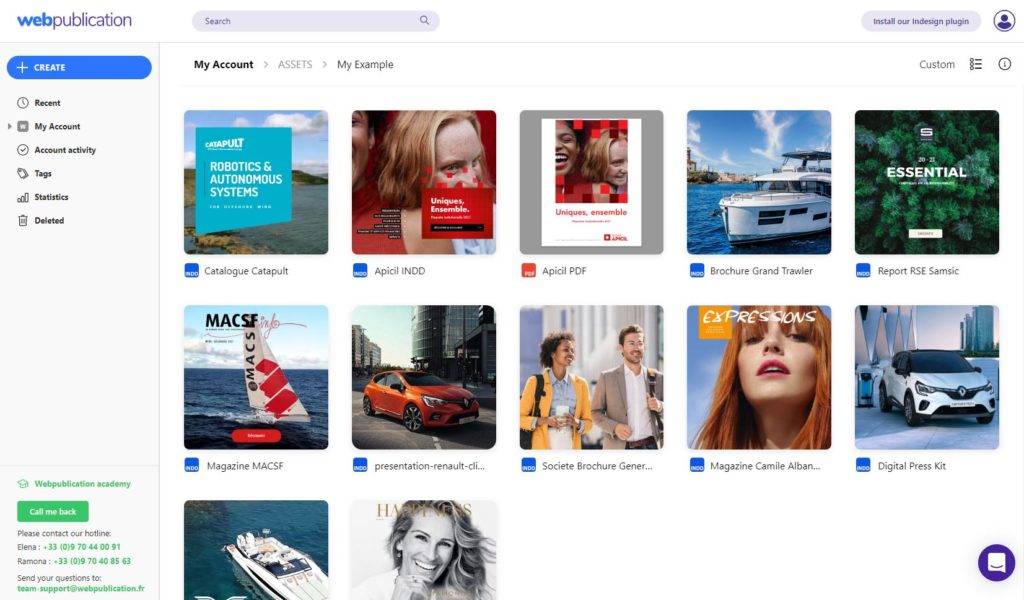
You can now switch between two view modes - Grid and Row
. The Grid mode shows large thumbnails especially suitable for browsing through media files and publications. The Row mode provides the users with detailed information for each item in the Drive. The view modes are available in the pages Drive, Recent assets and Search.
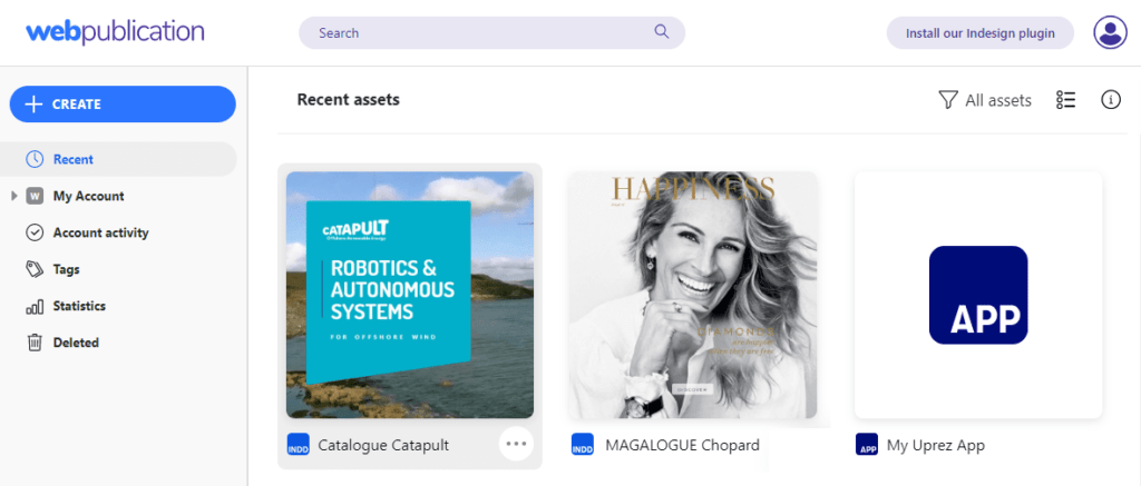
Recent assets page
Now it is possible to see all the recent publications created in your account. From there you can perform all of the actions available in the Drive. You can preview the publications, edit them and even change move them to a different folder with a simple drag-and-drop action. The Location field allows you to open the parent folder with just a single click. It is also possible to filter the items diplayed in the Recent page by type.
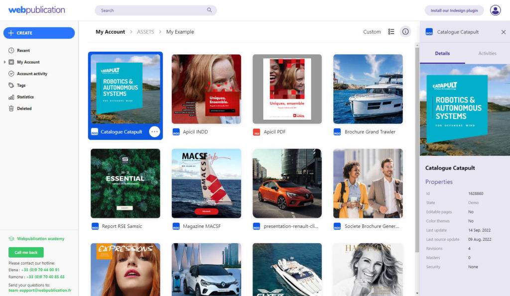
Information panel
Click on the info icon to activate the information panel on the right side of the Administration area. Select a drive item to see relevant information about it. The panel contains two tabs - Details and Activities. The Details tab shows information about the current state of the item and its revisions. The Activities tab provides an overview of the actions performed on a specific drive item and the user who performed them. When no items are selected the information panel will display relevant data about the folder you are currently browsing.
Plugin
One Page navigation mode
The Cross navigation mode has now been replaced by a more advanced and versatile page mode - One Page. With this mode all of the pages in the publication are seamlessly stacked in a single srollable column of content. In other words the pages become sections of a single page.
The appropriate media files are requested with "lazy loading" when they are near to the user's viewport making the publication fast to load and very suitable for browsing on mobile devices.
Animations and videos will play when the user scrolls to them.
The current page indicator is hidden by default, but it may be enabled from the Administration area. The page parameter in the url changes dynamically and can be used to navigate to a specific section in the publication.
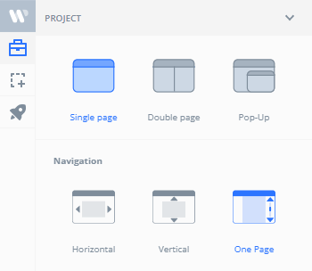
When the publication is in "Double page" mode then the pages will appear as a two-page spread on wide screens and a single page on mobile devices.
Reader
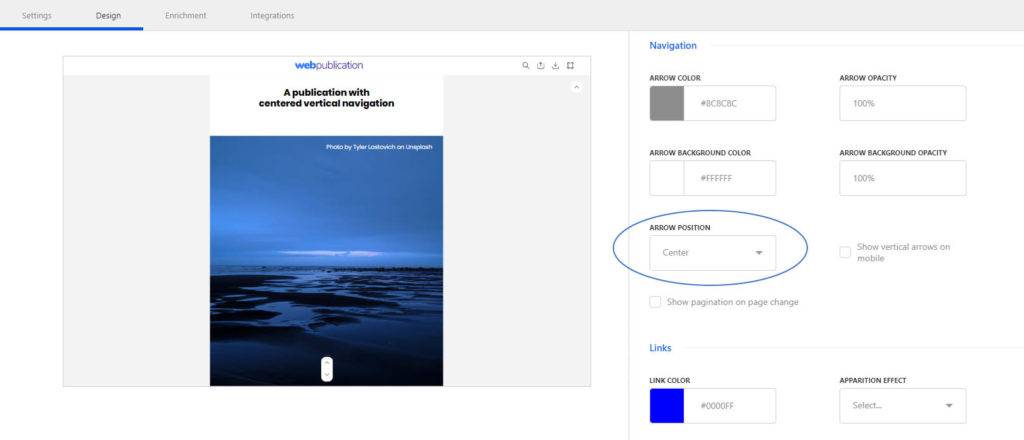
Vertical arrows can now be centered
As multiple users had requested, we have added the possibility to center the navigation arrows when using the Vertical navigation mode. It is advisable to disable the page indicator in this case because it would mask the arrow for a short while when the user navigates to a different page.
Slides transition with fade effect
Sliders now have a fade in / fade out effect when changed using the arrow navigation and when the autoplay is turned on.
Special characters are now also supported in sliders.
Other fixes and improvements
We've handled the following:
- A rare case when a single page after a double page was skipped by the navigation arrow.
- Publications opened in a popup from another publication that was downloaded on Uprez app are now working
- Gif images in popins are correctly hidden before the popins is opened
Uprez
App login in offline mode fixed
An issue coming from the improved session handling resulted in the impossibility to log in the Uprez App in offline mode. This problem is now solved.
We have aslo fixed a problem with custom cover images occasionally missing in offline mode.


No comments.